Verizon.com Architecture Redesign
Unifying consumer and business needs under one scalable system
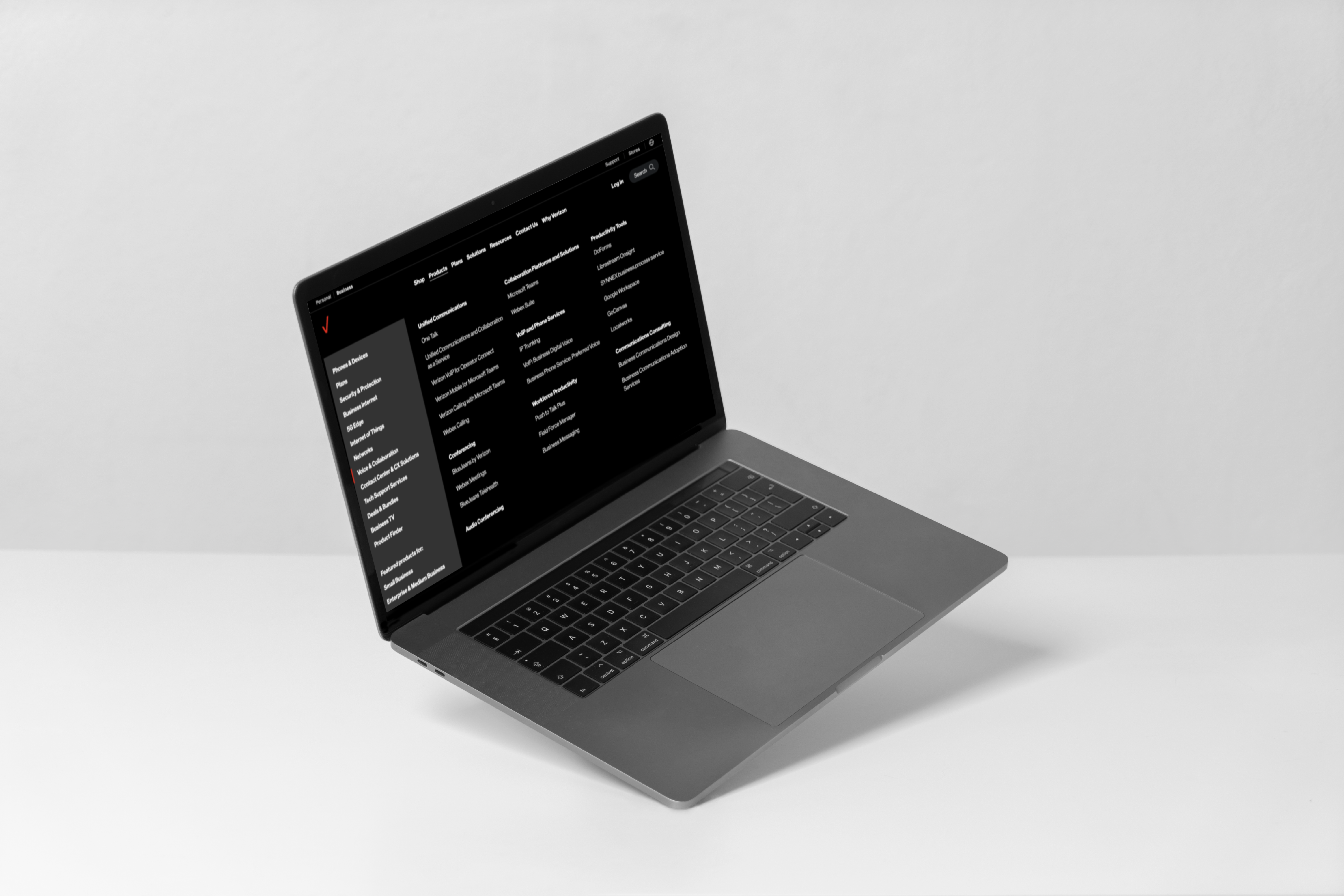
The Challenge
Redesign the entire site architecture for Verizon.com—across both consumer and business lines. The goal: create a cohesive structure that could support vastly different user needs, improve accessibility, and serve as a foundation for long-term scalability.
- Consumer: Help individuals find the right products, plans, and services quickly.
- Business: Enable decision-makers to navigate complex offerings and find tailored enterprise solutions.
All while navigating one of the most stakeholder-heavy environments imaginable.
My Role
As Associate Creative Director, I led a cross-functional team of four UX and visual designers over an 8-month engagement. I was responsible for vision alignment, system design, and day-to-day leadership across multiple stakeholder groups spanning marketing, product, accessibility, and brand.
The Approach
We approached the project as a systemic redesign—establishing a shared architecture and visual framework that could flex across both sides of the business. Key priorities included:
- Unifying navigation across products and plans
- Clarifying content hierarchy for vastly different audiences
- Increasing accessibility and reducing friction across flows
- Building flexibility into templates and page types for future scale
This required close collaboration with teams across the organization—balancing conflicting priorities, aligning around shared goals, and testing extensively.
The Outcome
We delivered a foundational architecture and flexible system now underpinning both the consumer and business experiences on Verizon.com. It dramatically improved usability and content findability, and while the work is still evolving, the core system we built continues to guide new initiatives.


